
May 27, 2025
How to Create an Excel Burndown Chart

In agile project management, a burndown chart is a powerful tool that visually represents the progress of a project over time. By tracking the completion of work against time, a burndown chart allows project teams to assess their progress and make data-driven decisions to optimize productivity. With the help of Microsoft Excel, creating a burndown chart is both accessible and customizable to meet the unique needs of your project. This article will guide you through the process, from understanding the basics of a burndown chart to maintaining and updating it throughout your project's lifecycle. Let's get started!
Understanding the Basics of a Burndown Chart
In order to create an effective burndown chart, it is essential to first understand its purpose and significance in project management. A burndown chart tracks the amount of work remaining in a project and visually depicts it on a graph. This allows project managers and teams to assess their progress at a glance, identifying any deviations from the project plan.
When delving deeper into the realm of burndown charts, it becomes evident that this tool is not only about tracking work progress but also about fostering transparency and accountability within a project team. By providing a clear visualization of work remaining over time, burndown charts empower team members to take ownership of their tasks and deadlines, promoting a sense of responsibility and commitment to the project's success.
What is a Burndown Chart?
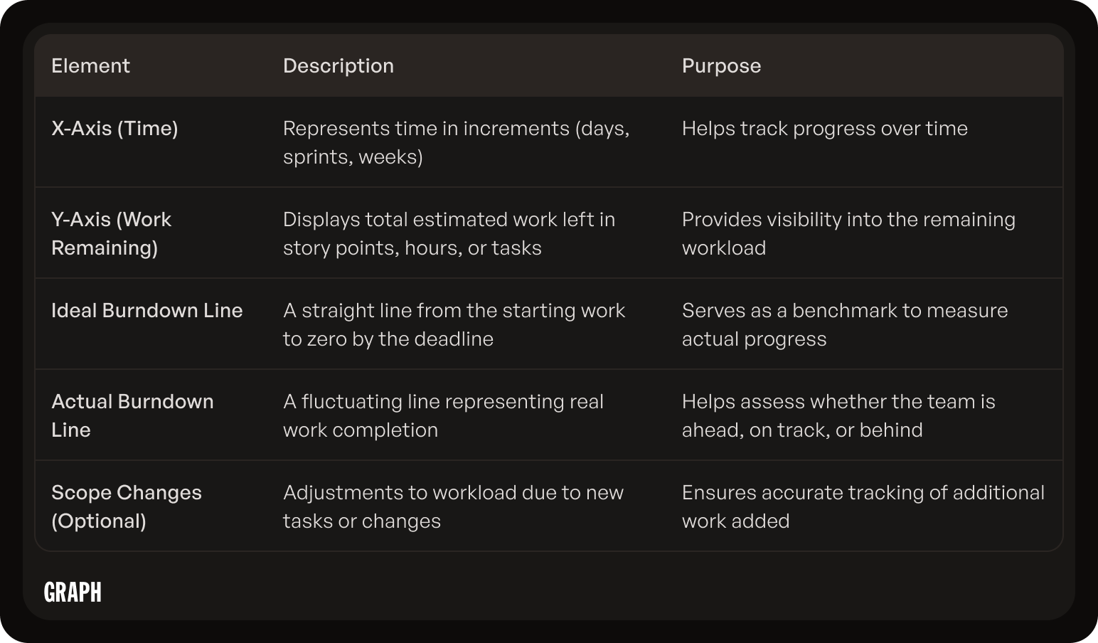
A burndown chart is a graphical representation of work remaining versus time. It typically consists of two axes: the x-axis represents time, divided into increments (often days or sprints), while the y-axis represents the amount of work remaining. As the project progresses, the graph should ideally trend downwards, representing the decreasing amount of work remaining until completion.
Moreover, burndown charts are not static entities but dynamic tools that evolve with the project. They provide a real-time snapshot of the project's status, enabling project managers to make data-driven decisions and adjustments as necessary. This adaptability is crucial in today's fast-paced and ever-changing business environment, where agility and responsiveness are key to project success.
Importance of a Burndown Chart in Project Management
A burndown chart provides several key benefits in project management. Firstly, it allows project teams to identify early signs of project risks or delays by visualizing deviations from the expected progress. Additionally, the chart serves as a tool for facilitating communication and collaboration within the team, as it provides a common understanding of the project's current status. By monitoring the burndown chart, project managers can make informed decisions to adjust resources, scope, or priorities as needed.
Furthermore, the use of burndown charts extends beyond project management and can also be leveraged in agile methodologies to improve sprint planning and execution. By analyzing historical burndown data, teams can gain insights into their capacity for future sprints, enabling more accurate estimations and better allocation of resources. This iterative approach fosters continuous improvement and efficiency in project delivery, ultimately leading to enhanced outcomes and client satisfaction.
Preparing Your Data for the Burndown Chart
Before diving into creating a burndown chart in Excel, it is crucial to gather and organize the necessary data. By preparing your data properly, you can ensure the accuracy and reliability of your burndown chart.
One important aspect to consider when preparing your data for a burndown chart is the granularity of the information. It is essential to break down tasks or user stories into manageable units to accurately track progress over time. This level of detail will provide valuable insights into the project's trajectory and help in identifying any potential bottlenecks.
Identifying Necessary Data
To create an Excel burndown chart, you will need certain project data, such as the list of tasks or user stories, their estimated effort, and the corresponding completion status. It is important to define and standardize these data elements across your project team to maintain consistency.
Additionally, consider including other relevant data points that can provide context to the burndown chart, such as dependencies between tasks, resources assigned to each task, and any external factors that may impact the project timeline. This comprehensive approach to data collection will offer a holistic view of the project's progress.
Organizing Your Data in Excel
Once you have identified the necessary data, it's time to organize it in Excel. Consider creating a separate worksheet within your Excel workbook to house the data for your burndown chart. You can structure the worksheet in a table format, with columns for tasks or user stories, estimated effort, and completion status, among other relevant information.
Furthermore, to enhance the usability of your burndown chart, you can use Excel's features such as data validation to ensure data integrity, conditional formatting to visually highlight progress trends, and pivot tables to analyze the data from different perspectives. These tools can help you transform raw data into actionable insights for effective project management.
Step-by-Step Guide to Creating a Burndown Chart in Excel
Now that your data is organized, it's time to create the burndown chart itself in Excel. By following these step-by-step instructions, you'll be able to generate a burndown chart that accurately reflects your project's progress.

Setting Up Your Excel Spreadsheet
Start by opening a new Excel workbook and navigating to the worksheet where you have organized your project data. Select the range of cells that contains the data, including the column headers. Then, click the "Insert" tab in the Excel ribbon and choose the chart type "Line." Select the "2D Line Chart" option from the drop-down menu.
When setting up your Excel spreadsheet for the burndown chart, it's important to ensure that your data is well-structured and organized. Clear and concise data organization will make it easier to create an accurate and visually appealing chart. Consider using separate columns for different data points, such as estimated effort, actual completion, and dates, to streamline the chart creation process.
Inputting Your Data
On the right side of the Excel window, you will see a "Chart Data" tab. Here, you can input the data series for your burndown chart. Create two series: one for the estimated effort and another for the actual completion. Ensure that the data series are represented correctly and accurately reflect the project's progress.
Accuracy in data input is crucial when creating a burndown chart. Double-check your data entries to avoid any discrepancies that could lead to misleading chart results. Additionally, consider using Excel's built-in features, such as data validation and conditional formatting, to maintain data integrity and improve the overall quality of your burndown chart.
Creating the Chart
Once your data is inputted, click the "Design" tab in the Excel ribbon. Here, you can customize the appearance of your burndown chart by changing the chart style, colors, and labels. Experiment with different options to find the visual representation that best suits your project's needs.
Customizing the chart's design can help emphasize key data points and trends, making it easier for stakeholders to interpret the information presented. Consider adding trendlines, data markers, and axis labels to provide additional context to your burndown chart. Remember, a well-designed chart not only conveys information effectively but also enhances the overall presentation of your project's progress.
Customizing Your Excel Burndown Chart
While the default Excel burndown chart provides valuable information, you can further enhance its effectiveness by customizing various elements. Customization allows you to personalize the chart to better suit your project's requirements and make it more visually appealing and informative.
One way to take your Excel burndown chart to the next level is by incorporating trendlines. Trendlines help identify patterns and trends in your data, making it easier to forecast future progress. To add a trendline, right-click on the data series in your chart, select "Add Trendline," and choose the type of trendline that best fits your data.
Adding Data Labels
By adding data labels to your burndown chart, you can display the specific values or percentages for each data point. This makes it easier to interpret the chart and track progress more precisely. To add data labels, select the chart, click on the "Layout" tab in the Excel ribbon, and choose the "Data Labels" option.
Data labels can provide quick insights into how your project is progressing and highlight any deviations from the expected trajectory. You can customize the appearance of data labels, including font size, color, and position, to ensure they are easily readable and complement the overall design of your chart.
Adjusting Chart Elements
Excel offers a range of customization options to help you tailor your burndown chart to your specific needs. You can adjust chart elements such as axes, gridlines, titles, and legends to enhance readability and clarity. Experiment with different settings and formats to find the optimal configuration for your chart.
Furthermore, consider adding annotations to your burndown chart to provide additional context or highlight important milestones. Annotations can draw attention to significant events or changes in the project timeline, making it easier for stakeholders to understand the chart at a glance. To add annotations, right-click on the chart, select "Add Annotation," and enter the relevant information.
Troubleshooting Common Issues in Excel Burndown Chart Creation
While creating an Excel burndown chart is relatively straightforward, you may encounter some common issues along the way. Here are a few troubleshooting tips to help you address these challenges.
When delving into the realm of Excel burndown charts, it's essential to pay attention to the finer details that can make or break your chart's accuracy and visual appeal. By understanding the nuances of data input, formulas, and formatting, you can elevate your chart creation process to new heights of precision and clarity.
Dealing with Incorrect Data Display
If your burndown chart is not reflecting the correct data or is displaying errors, double-check your data input and ensure that the formulas or calculations are accurate. Verify that the data series are correctly linked to the corresponding cells in your Excel worksheet.
One common pitfall that many Excel users encounter is overlooking the importance of data validation and verification. Taking the time to meticulously review each data point and formula can save you from the headache of troubleshooting errors later on. Remember, the devil is in the details when it comes to crafting a flawless burndown chart.
Resolving Formatting Issues
If your burndown chart's formatting appears distorted or inconsistent, check the formatting of your Excel worksheet. Ensure that the data ranges and series are properly defined, and that any conditional formatting or other formatting rules are applied consistently throughout the workbook.
Consistency is key when it comes to formatting in Excel. From color schemes to font styles, maintaining a cohesive visual language throughout your burndown chart not only enhances its aesthetic appeal but also aids in conveying information effectively. Remember, a well-formatted chart is not just visually pleasing – it also speaks volumes about your attention to detail and professionalism.
Maintaining and Updating Your Burndown Chart
Creating the initial burndown chart is just the beginning. To effectively track your project's progress, it is essential to regularly maintain and update the burndown chart throughout the project's lifecycle.
One crucial aspect of maintaining a burndown chart is to ensure that it remains a true reflection of the project's status. This involves not only adding new data as the project progresses but also making adjustments to account for any changes in project scope, timeline, or resources. By diligently updating the burndown chart, project managers can gain valuable insights into the project's trajectory and make informed decisions to keep it on track.
Adding New Data
As your project evolves, new tasks or user stories may be added or removed. It is important to update your burndown chart accordingly, capturing any changes to the project scope or milestones. By consistently adding new data and adjusting the chart, you can maintain an accurate representation of the project's progress.
Moreover, adding new data to the burndown chart allows team members to visualize the incremental completion of tasks over time. This visibility not only fosters transparency within the team but also helps in identifying any bottlenecks or delays that may arise during the project lifecycle.
Adjusting for Project Changes
Project plans are rarely set in stone. Changes in priorities, resources, or requirements can impact the project timeline and scope. When such changes occur, it is necessary to update the burndown chart to reflect the new reality. Adjust the data series and chart elements as needed to accurately reflect the project's updated course.
By proactively adjusting the burndown chart for project changes, project managers can effectively communicate shifts in project dynamics to stakeholders. This transparency not only builds trust but also allows for collaborative problem-solving to address any emerging challenges and ensure project success.
Tips for Effective Use of Burndown Charts
Now that you have created your Excel burndown chart, it is important to maximize its effectiveness in project management. Here are some tips to help you make the most of your burndown chart:
Interpreting Burndown Chart Data
While the burndown chart provides valuable insights, it is crucial to interpret the data correctly. Monitor the chart regularly and identify any deviations from the expected progress. Analyze the reasons behind these deviations and take appropriate actions to keep the project on track.
For example, if you notice a sudden increase in the remaining work towards the end of a sprint, it could indicate that the team underestimated the complexity of certain tasks. By recognizing this pattern, you can address the issue by reevaluating the remaining work and adjusting the team's capacity accordingly. This proactive approach will help you maintain a realistic and achievable project timeline.
Using Burndown Charts for Team Communication
Share the burndown chart with your project team and stakeholders to foster transparency and collaboration. Regularly discuss the chart's progress during team meetings or project reviews. Encourage team members to provide input and suggestions based on their interpretation of the burndown chart. This will enhance communication and ensure that everyone is aligned and informed about the project's status.
Additionally, consider using the burndown chart as a visual aid during client or stakeholder presentations. By showcasing the progress and the remaining work in a clear and concise manner, you can effectively communicate the project's status and build trust with your stakeholders.
Creating an Excel burndown chart is a valuable skill for software engineers and project managers alike. By leveraging Excel's functionality and customizability, you can track your project's progress with ease and make data-driven decisions to optimize productivity.
Remember to regularly update and maintain your burndown chart to ensure its accuracy and relevance throughout your project's lifecycle. With this powerful tool at your disposal, you can confidently steer your project towards success.
