
May 27, 2025
Understanding Flamegraphs: A Comprehensive Guide

In the world of software engineering and performance optimization, flamegraphs have emerged as a valuable tool for visualizing profiling data and understanding program behavior. This guide aims to provide a thorough understanding of flamegraphs, their uses, and how they can significantly enhance performance analysis and software optimization.
What are Flamegraphs?
Flamegraphs are a visualization technique used primarily for performance profiling and optimization. They depict stack traces of applications in a compact and intuitive format, allowing developers to identify performance bottlenecks quickly. By visualizing the call stack over time, flamegraphs enable engineers to see which functions consume the most processing time.
The Basics of Flamegraphs
At their core, flamegraphs consist of a horizontal bar chart where each box represents a function or method in the call stack. The width of each box correlates with the amount of time spent in that function during execution. Stacked atop one another, these boxes create a flame-like appearance, hence the name. Flamegraphs are typically generated from profiling data collected during application runtime.
To create a flamegraph, developers often use tools that gather call stack information, which is then transformed into a visual format. The generated flamegraph visually represents the hierarchy of function calls, enabling developers to pinpoint where performance issues occur within the call chain. This transformation from raw data to visual representation is crucial, as it allows developers to quickly grasp complex relationships and dependencies between functions that might not be apparent in traditional profiling outputs.
The Importance of Flamegraphs in Performance Analysis
Flamegraphs play a crucial role in performance analysis by providing a clear overview of where time is being spent in an application. This visibility is essential for engineers tasked with optimizing performance and improving user experience. By identifying functions that contribute heavily to execution time, developers can make informed decisions about where to focus their optimization efforts. Furthermore, flamegraphs can be particularly beneficial in identifying not just the slowest functions, but also those that are frequently called, which can lead to cumulative performance issues.
Moreover, flamegraphs are advantageous because they simplify complex data. Traditional profiling tools may output raw data in text form, which can be difficult to interpret. Flamegraphs, however, provide a visual interface that enhances comprehension and facilitates quicker decision-making. This visual clarity is especially useful in collaborative environments where multiple stakeholders may need to understand performance metrics without delving into technical details. Additionally, flamegraphs can be used iteratively; as developers implement optimizations, they can generate new flamegraphs to compare performance before and after changes, thus fostering a culture of continuous improvement and data-driven decision-making.
The Anatomy of a Flamegraph
To effectively use flamegraphs, it’s essential to understand their structure. Each flamegraph consists of multiple components that come together to deliver the insights required for performance optimization.

Understanding the Vertical and Horizontal Axis
The vertical axis of a flamegraph typically represents the call stack’s depth, showing how deep in the call stack each function resides. The topmost boxes indicate the functions that were invoked last, while those lower down in the stack were invoked earlier. This depth helps developers understand the context of each function call.
On the other hand, the horizontal axis indicates the amount of time spent in each function. Wider boxes mean more time, indicating functions that may need optimization. By analyzing the relationships between different functions via their positioning, engineers can better understand how they contribute to overall execution time.
Moreover, the arrangement of these boxes can also reveal patterns in function calls that might not be immediately obvious. For example, a series of narrow boxes stacked vertically could indicate a recursive function that is being called multiple times, while a wide box at the top level might suggest a bottleneck that is affecting the performance of the entire application. This visual representation allows developers to quickly identify not just which functions are slow, but also how they interact with one another, providing a more holistic view of the performance landscape.
Color Coding in Flamegraphs
Color coding is another vital aspect of flamegraphs that aids in quick comprehension. Different colors are often used to differentiate various types of functions or categorize them by functionality. For instance, you might see specific colors representing system calls, user-defined functions, or library calls.
This color differentiation can quickly highlight areas of concern in a performance profile, allowing engineers to focus on specific categories when optimizing. Understanding these colors and their significance can lead to more efficient debugging and optimization processes.
Additionally, some flamegraph tools allow for customizable color schemes, enabling teams to define their own color-coding conventions based on the specific needs of their projects. This flexibility can be particularly beneficial in large codebases where multiple teams may be working on different components. By establishing a consistent color scheme, teams can ensure that everyone interprets the flamegraph in the same way, fostering better communication and collaboration when addressing performance issues. Furthermore, the ability to visually segment different types of functions can help prioritize which areas to tackle first, making the optimization process more strategic and effective.
How Flamegraphs Work
To leverage flamegraphs effectively, it's crucial to understand their creation process, as well as how to read and interpret the information they provide.
The Process of Generating Flamegraphs
Generating flamegraphs typically involves three main steps: data collection, data transformation, and visualization. Initially, profiling tools collect runtime stack traces, which detail the function calls and their respective execution times. This data is often gathered via various profiling methods, such as sampling profilers that periodically check the state of a running application. These profilers can be integrated into the application or run externally, allowing developers to capture performance data without significant overhead.
Once the data is collected, it's processed into a format suitable for visualization. This transformation often involves aggregating the stack traces to summarize how much time was spent in each function. The aggregation process can include filtering out noise from the data, such as short-lived functions that may not significantly impact performance. Finally, using visualization tools, the transformed data is rendered into a flamegraph that represents the collected information in a visually meaningful way. This visualization typically employs color coding to indicate different types of functions or execution states, enhancing the ability to quickly identify performance bottlenecks.
Reading and Interpreting Flamegraphs
Reading flamegraphs requires some practice. When analyzing a flamegraph, focus initially on the widest bars, as they indicate the functions that require the most processing time. From there, drill down into specific functions to explore how they relate to their callers and callees. Understanding the context of these functions is vital; for instance, a function that appears to take a long time might be called frequently, or it could be a single, expensive operation that is called less often. This distinction can guide optimization strategies effectively.
It’s also essential to keep in mind the two-dimensional nature of flamegraphs. While width suggests time spent, vertical positioning reflects the relationship within the call hierarchy. Thus, identifying a wide box at the top or in the middle can lead to targeted optimization efforts. Additionally, flamegraphs can be used to compare different runs of an application or different configurations, allowing developers to visualize the impact of changes over time. By layering multiple flamegraphs, one can gain insights into how modifications to the codebase influence performance, enabling a more data-driven approach to optimization.
Different Types of Flamegraphs
Flamegraphs come in various forms depending on the aspect of performance being analyzed. Understanding the different types can help engineers choose the right tool for their specific needs.
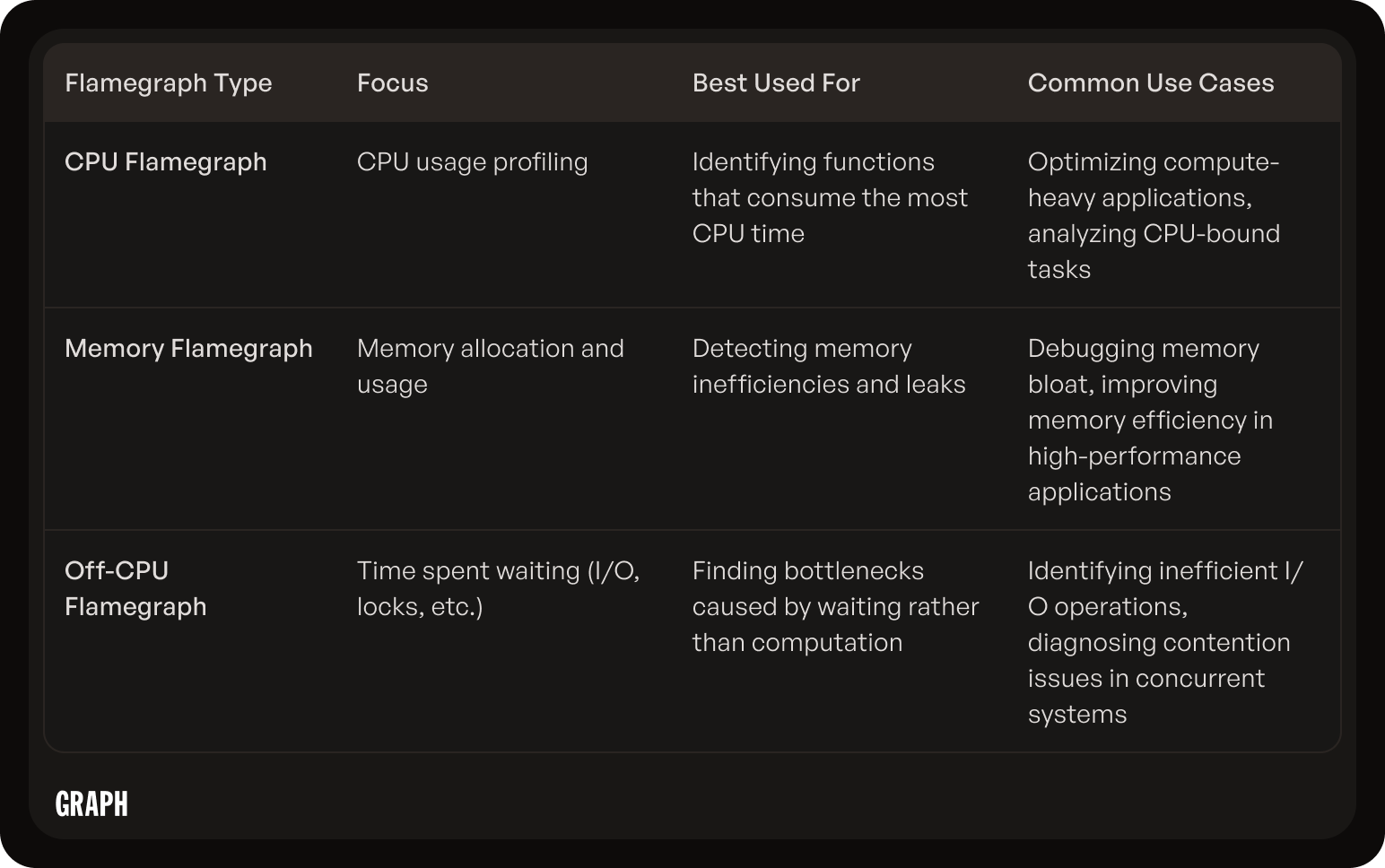
CPU Flamegraphs
CPU flamegraphs are the most common type, focusing on CPU usage during the execution of the application. They help in identifying functions that consume significant CPU resources, making them invaluable for optimizing compute-heavy applications. By profiling CPU utilization, developers can determine which areas of their code may require simplification or optimization. Additionally, CPU flamegraphs can be particularly useful in multi-threaded environments, where they can reveal how thread contention and scheduling may affect overall performance. This insight allows engineers to make informed decisions about thread management and resource allocation, ultimately leading to more efficient and responsive applications.
Memory Flamegraphs
Memory flamegraphs, on the other hand, focus on memory allocation and usage. These flamegraphs visualize how much memory different functions utilize, which can reveal memory leaks or inefficiencies in memory handling. This is crucial in environments where memory resources are limited, or where high performance demands tight memory usage. Furthermore, memory flamegraphs can also assist in understanding the lifetime of allocated memory, helping developers identify objects that are not being released properly. By analyzing these patterns, engineers can implement better memory management strategies, which not only enhance performance but also improve the stability and reliability of applications over time.
Off-CPU Flamegraphs
Off-CPU flamegraphs capture periods when the CPU is not actively executing code, such as during I/O waits or while waiting for locks. These flamegraphs provide insight into application behavior that isn't visible in CPU flamegraphs, highlighting potential bottlenecks caused by resource contention or external dependencies. By examining off-CPU time, developers can identify whether the application is spending excessive time waiting for data from disk or network resources, which can lead to significant performance degradation. Additionally, off-CPU flamegraphs can reveal patterns in lock contention, helping teams to refactor code to minimize blocking and improve concurrency. This level of detail is essential for fine-tuning applications that rely heavily on external systems or that require high levels of parallel processing, ensuring that resources are utilized as efficiently as possible.
Flamegraphs vs. Other Visualization Tools
While flamegraphs offer considerable advantages for performance analysis, it's essential to compare them against other visualization tools to understand their unique benefits and limitations.
Advantages of Flamegraphs
One of the primary advantages of flamegraphs is their compact representation of complex data. Unlike traditional profiling outputs, which can be overwhelming, flamegraphs provide a single view that summarizes stack traces efficiently. Furthermore, they enable quick visual scanning to pinpoint problematic areas in the code. This efficiency is particularly beneficial in large codebases where developers may struggle to identify performance issues amidst a sea of data.
Flamegraphs are also versatile; they can be generated for various programming languages and environments, making them a universal solution for performance visualization. Additionally, their ability to illustrate both call relationships and execution time provides insights that are hard to achieve with other tools. This dual representation allows developers to not only see which functions are consuming the most time but also understand the context in which these functions are called, leading to more informed optimization strategies.
Limitations of Flamegraphs
Despite their advantages, flamegraphs have limitations. They are primarily focused on identifying performance bottlenecks related to execution time, which may not encompass all performance aspects, such as network latency or user experience metrics. For instance, while a flamegraph might highlight a slow-running function, it may not reveal whether the delay is due to an inefficient algorithm or external factors like API response times. Additionally, the quality of a flamegraph depends heavily on the profiling data’s accuracy and completeness. Insufficient or poorly collected data can lead to misleading visualizations. This reliance on accurate data collection underscores the importance of employing robust profiling techniques and tools to ensure that the flamegraphs generated are truly representative of the application's performance.
Moreover, flamegraphs can become less effective when dealing with highly concurrent applications, where multiple threads may obscure the visualization. In such cases, the flamegraph may not clearly delineate which thread is responsible for specific performance issues, making it challenging to pinpoint the root cause of a problem. Other visualization tools, such as timeline charts or interactive profilers, might offer better insights into concurrency issues by providing a more granular view of execution over time. These tools can complement flamegraphs, providing a more comprehensive performance analysis toolkit that addresses various aspects of application behavior.
Practical Applications of Flamegraphs
Flamegraphs have numerous practical applications in both software development and system performance optimization, serving as a critical tool for engineers seeking to enhance application efficiency.
Flamegraphs in Software Development
In software development, flamegraphs are utilized during the testing and debugging processes to pinpoint inefficient code sections. By integrating flamegraph generation into the development lifecycle, engineers can continuously monitor and optimize their code, leading to better-performing applications.
Moreover, flamegraphs aid in understanding how new code changes impact performance. When new features are added or existing features are modified, developers can use flamegraphs to quickly assess whether those changes introduce performance regressions. This proactive approach not only helps in maintaining code quality but also fosters a culture of performance awareness among the development team, encouraging them to consider efficiency as a core aspect of their coding practices.
Additionally, flamegraphs can be instrumental in onboarding new developers to a codebase. By visualizing the performance characteristics of different modules, newcomers can quickly grasp which parts of the application are critical for performance and where they might focus their optimization efforts. This visual representation acts as a guide, facilitating a smoother transition into the team and enhancing overall productivity.
Flamegraphs in System Performance Optimization
For system performance optimization, flamegraphs are invaluable in diagnosing and analyzing system-level performance issues. They assist in identifying which processes or services within a system are consuming excessive resources, enabling system administrators to take corrective actions.
Through the insights gained from flamegraphs, organizations can prioritize optimization efforts based on solid data, ultimately leading to enhanced system performance and reduced costs. Furthermore, flamegraphs can be used in conjunction with other monitoring tools to provide a comprehensive view of system health. By correlating flamegraph data with metrics such as CPU usage, memory consumption, and I/O operations, administrators can develop a nuanced understanding of system behavior under various loads and conditions.
In high-availability environments, where performance bottlenecks can lead to significant downtime and loss of revenue, flamegraphs become an essential part of the troubleshooting toolkit. They allow teams to visualize historical performance data, enabling them to spot trends and anomalies over time. This historical analysis can be crucial for capacity planning and for making informed decisions about scaling infrastructure to meet future demands.
Future of Flamegraphs
The future of flamegraphs holds exciting possibilities as technology advances and performance profiling becomes increasingly sophisticated.
Emerging Trends in Flamegraph Use
As software becomes more complex and distributed, flamegraphs are likely to adapt to show more intricate relationships between microservices and other components in cloud-based architectures. There’s also a growing interest in using flamegraphs within various domains such as machine learning and data science, where performance profiling can be equally crucial.
With the integration of machine learning techniques, flamegraphs may evolve to offer predictive insights about performance trends based on historical data, allowing developers to proactively optimize their systems. This predictive capability could revolutionize how engineers approach performance bottlenecks, shifting from reactive fixes to proactive strategies that anticipate issues before they arise. Moreover, as data sets grow larger and more complex, the ability to visualize and interpret performance data through flamegraphs will become indispensable in ensuring that algorithms run efficiently and effectively.
Potential Developments in Flamegraph Technology
Future developments in flamegraph technology could include more interactive and user-friendly visualization tools that enhance usability and provide deeper insights. The introduction of real-time profiling and flamegraph generation might allow for immediate feedback during development, resulting in better optimization before deployment. Enhanced interactivity could enable developers to drill down into specific areas of interest, dynamically adjusting parameters to see how changes affect performance in real-time.
As the ecosystem around flamegraphs grows, we can expect more integrations with existing observability and monitoring tools, further enhancing their applicability and effectiveness in modern software engineering practices. This could lead to the emergence of standardized frameworks for flamegraph generation, making it easier for teams to adopt and implement these tools across various platforms. Additionally, collaboration features could be introduced, allowing teams to share insights and findings in a more streamlined manner, ultimately fostering a culture of collective problem-solving and continuous improvement in performance optimization.
Furthermore, as the demand for high-performance applications continues to rise, flamegraphs may evolve to incorporate advanced analytics and machine learning models that can identify not just where performance issues occur, but also why they happen. By correlating flamegraph data with other performance metrics, such as memory usage and network latency, developers could gain a holistic view of their application’s performance, leading to more informed decision-making and efficient resource allocation.
